I always determine the paint color after all of the furniture, fabrics and finishes have been selected because wall color is really what pulls the whole room together. Most of the paint colors I do are custom paint colors for this reason. I always suggest consulting a designer on what color would best to pull everything together under your specific color of light in the space. You would be amazed at how the light changes in different geographical locations. For example you wouldn’t take the hot bright colors used near the equator and expect them to look amazing in Alaska, but the same applies from midwest to west coast. Having said that the below are a few of my favorite colors under the San Franciscan sun.

Neutrals:
- Revere Pewter Benjamin Moore
- Rockport Grey Benjamin Moore
- Wood Ash C2-439M by C2 Paint
- Urban Living RLUL215 Ralph Lauren
- Ventana 11-25 Pratt & Lambert
- Devonshire Green 1489 Benjamin Moore
- Silver Mink 33-25 Pratt & Lambert
- A late addition, but absolutely gorgeous and masculine is 1547 Dragon’s Breath by Benjamin Moore
You may also like...

Rachel Blindauer Interior Design is on the Cover of CA Home + Design
Come ooh & aww with me and at our featured Eichler Casual Color Pop design on CAHome + Design
Design Details Make All the Difference
The devil is in the details. Historic design details mask a fully modern and savvy home.
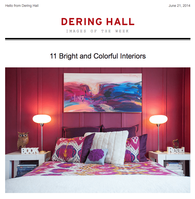
Dering Halls 11 Bright and Colorful Interiors
An architect once said to me, “You thrive in color.” So when I saw this article it was truly heartwarming.