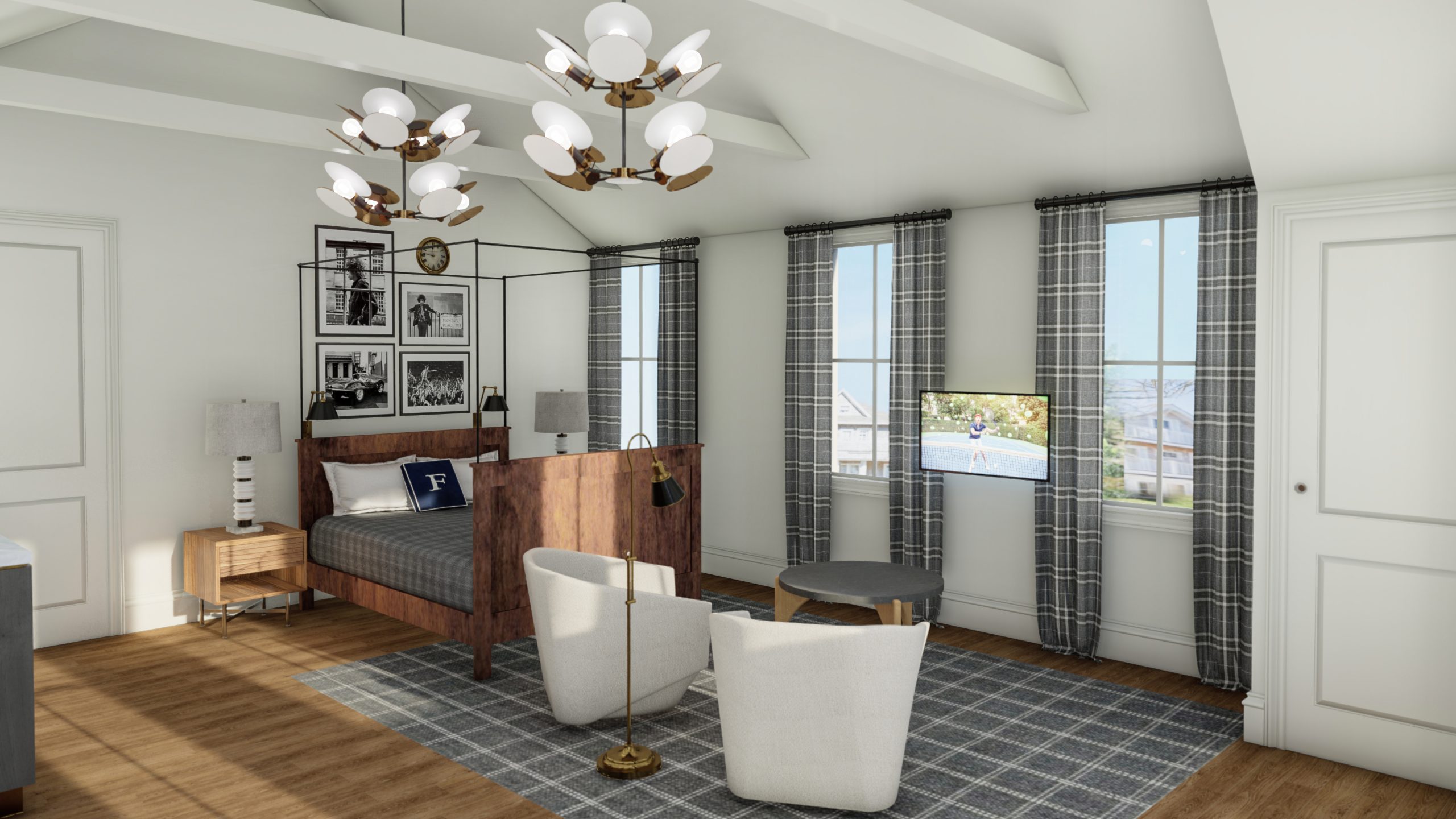
I always determine the paint color after all of the furniture, fabrics and finishes have been selected because wall color is really what pulls the whole room together. Most of the paint colors I do are custom paint colors for this reason. I always suggest consulting a designer on what color would best to pull everything together under your specific color of light in the space. You would be amazed at how the light changes in different geographical locations. For example you wouldn’t take the hot bright colors used near the equator and expect them to look amazing in Alaska, but the same applies from midwest to west coast. Having said that the below are a few of my favorite colors under the San Franciscan sun.

Neutrals:
- Revere Pewter Benjamin Moore
- Rockport Grey Benjamin Moore
- Wood Ash C2-439M by C2 Paint
- Urban Living RLUL215 Ralph Lauren
- Ventana 11-25 Pratt & Lambert
- Devonshire Green 1489 Benjamin Moore
- Silver Mink 33-25 Pratt & Lambert
- A late addition, but absolutely gorgeous and masculine is 1547 Dragon’s Breath by Benjamin Moore
You may also like...
The Ceiling is the Fifth Wall
Next time you look at a naked ceiling ask yourself these questions
AN INTERIOR DESIGNER’S GUIDE TO SARASOTA
Sarasota, Florida is a vibrant city that offers a multitude of dining options with diverse atmospheres and menus. In this blog post, we will explore some of the top establishments in Sarasota, including Bar Hana, Kojo, Art Ovations Perspective Bar, Shore Long Boat...